
A 5-minute guide to better typography.


Bad fonts ruin a good fundraising message.
From pitch decks to grant applications.
If your words don’t look good on the page, donors won’t read them. But research found that changing a single font increased reading speed and comprehension by 35%.
So you should learn basic typography.
Get this five-minute guide to sharpen your brand.
Polish your fonts.
Polish your fundraising.
💪🏽💛
Need my help?
If this advice is useful — but you're ready to get even more fundable and findable — check out Brand Bootcamp.
It's our self-paced, online course to maximize your funding. In just 15 minutes a day.

The daily bonus
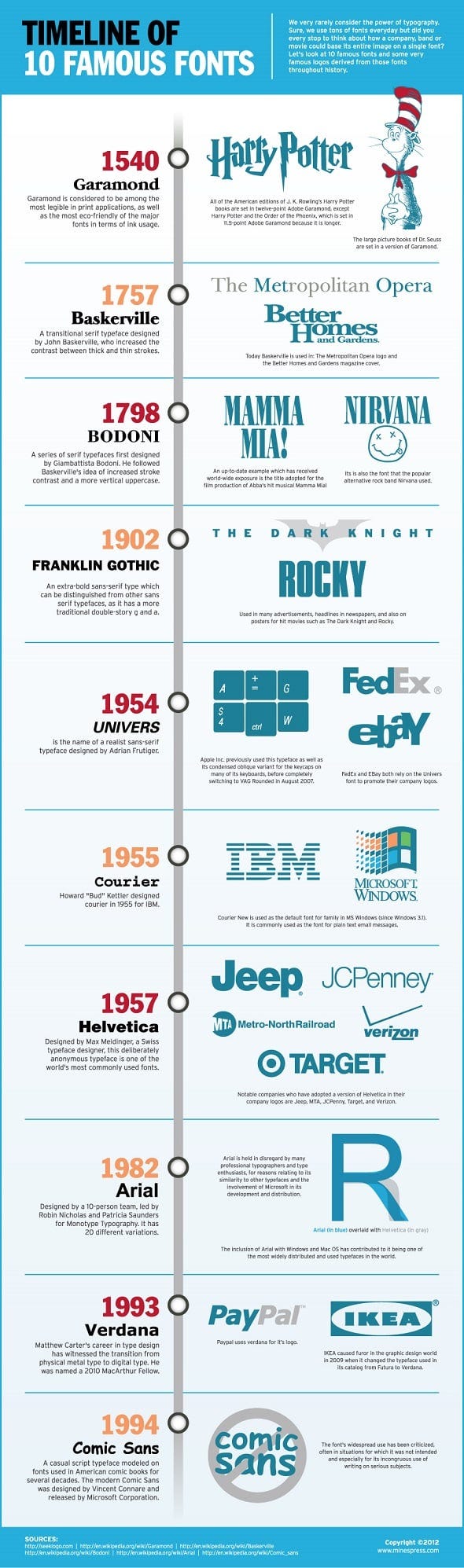
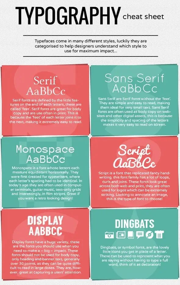
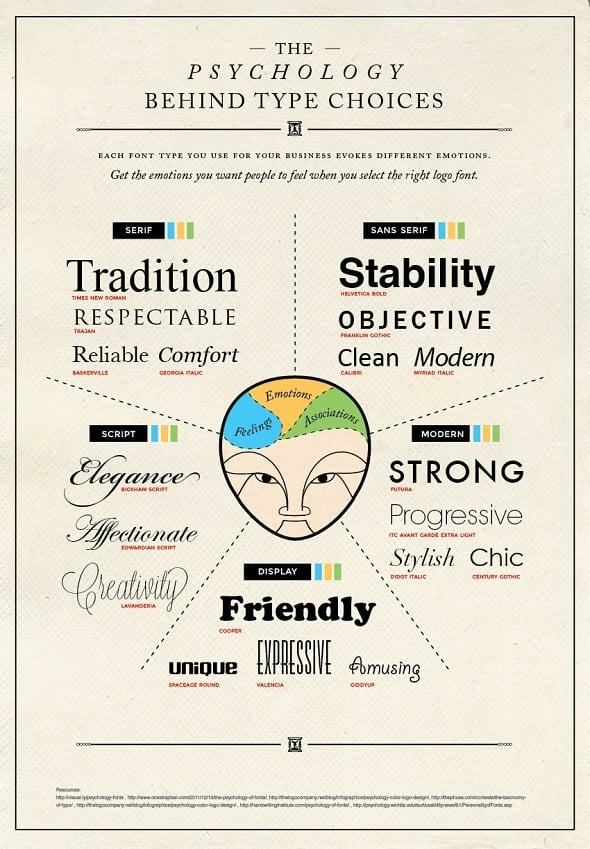
Three (fun!) typography infographics. ⤵
Sneak peek
Coming up in tomorrow’s newsletter:
Calling it donor acquisition objectifies the fundraising experience. Because the definition is to buy or obtain an asset or object.